Revamped Bioreactor Interface Reduced Interaction Time by 35%, Eliminated Confusion, and Empowered Lab Operators.
Bioreactor interface redesign

Duration
2 Months
Ux/Ui designer
Rol
About project
This project focused on enhancing the bioreactor control platform used in laboratories to monitor and manage bacterial cultures. The initial interface presented challenges with cluttered visuals and inconsistent navigation, making it difficult for operators to perform essential tasks efficiently. By simplifying the interface and optimizing key functions like starting new cultures and monitoring critical parameters, the redesign successfully improved user experience, reduced errors, and increased operational efficiency, providing a more intuitive and streamlined control system for laboratory operators.

As the UX/UI designer, I redesigned the HMI to be more intuitive and user-friendly. By simplifying navigation and clarifying visual cues, I significantly reduced interaction time and training needs, resulting in a more efficient and confident user experience.
The Challenge: A Bioreactor HMI Failing to Meet Laboratory Needs.
Achievements
Reduced User Confusion: Simplified interface design, leading to a 35% reduction in user interaction time.
Minimized Training Requirements: Enhanced usability effectively reduced the need for repeated training sessions.
Promoted UX Culture: Successfully advocated for integrating user-centered design principles into the company's standard operating procedures, fostering a culture of UX across the organization.

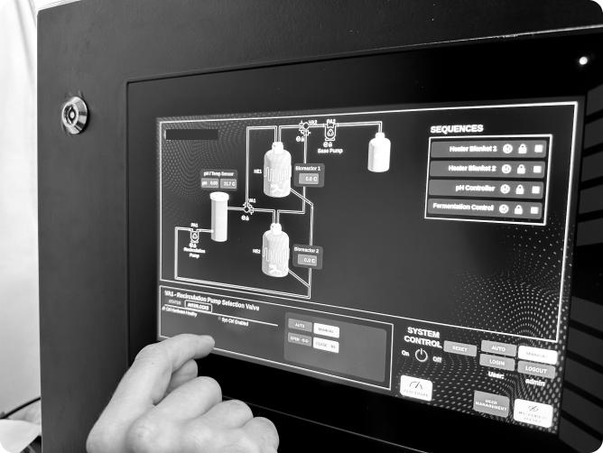
The bioreactor's Human-Machine Interface (HMI), crucial for bacterial cultivation, was designed primarily with an engineering perspective. This focus resulted in critical usability setbacks:
-
The HMI was complicated, filled with technical jargon, and the critical functions for laboratory operations were buried under maintenance features.
-
The layout was cluttered and inconsistent, lacking intuitive visual cues that led to frequent user errors and heightened frustration.
-
Laboratory operators, the primary users, depended excessively on technical support team for routine operations.
Engineer feedback suggested the interface was cluttered and inconsistent, requiring multiple training sessions and highlighting usability issues. To pinpoint these issues, I conducted a design audit and usability tests with three engineers and two lab operators. This helped confirm the design problems and understand user pain points more clearly.
This insight sparked a deeper interest, as it indicated the need to reevaluate the user needs, reconsider the user journey, and restructure the information architecture accordingly.
They felt the interface was designed more for machine maintenance than for their daily tasks in the lab.
One recurring issue from the lab operators stood out:
When the Interface Serves the Machine, Not the User:
Uncovering the Misalignment Between Lab Operators' Needs and Design Priorities
User needs:
To better understand user needs, I conducted a contextual interview with lab operators to observe their manual workflow with a non-automated bioreactor. Based on their processes, I created a user journey that reflected their tasks and developed a navigation map that more accurately matched their real-world workflow.
New user Journey
Nav map before and after
Meeting the needs
BUSINESS NEEDS
USER NEEDS
Deliver a Bioreactor that functions autonomously and is fully automated while keeping costs low for the interface redesign.
A clear and intuitive interface that genuinely reduces errors and saves time in processes related to the bioreactor.
Limitations
-
Reduced Budget: The UX process was not considered from the start, leading to financial constraints.
-
Limited Time: There was pressure not to exceed the promised delivery date to the laboratory.
-
Design Constraints: The absence of a dedicated front-end developer limited the design possibilities.
How Can I Redesign This Interface to Meet User Needs While Aligning with Business Interests?
MVP Focus: Aim to release a Minimum Viable Product that meets core user needs, allowing for a timely launch with potential for future enhancements.
Parallel Processes: Run UX research and design alongside development to implement design insights promptly and keep the project on track.
Prioritization: Concentrate on crucial redesign aspects that enhance user experience, like simplifying common workflows and addressing major issues to maximize the redesign’s value.
Simple and Clear Design: Adopt a straightforward design to stay on schedule and within budget, especially without a dedicated front-end developer, avoiding costly external hires.
Roadmap
This roadmap prioritizes features and enhancements from user feedback, usability tests, interviews, and design audits. By focusing on critical improvements first, we ensure the interface evolves to maximize usability, efficiency, and user satisfaction.

Wireframes: Consolidating Information on Screens
Resources monitoring screen
Machine maintenance monitoring screen
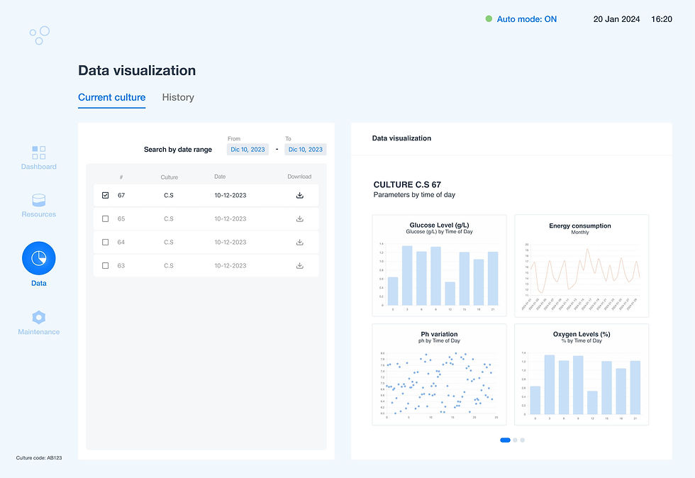
Data visualization and reports

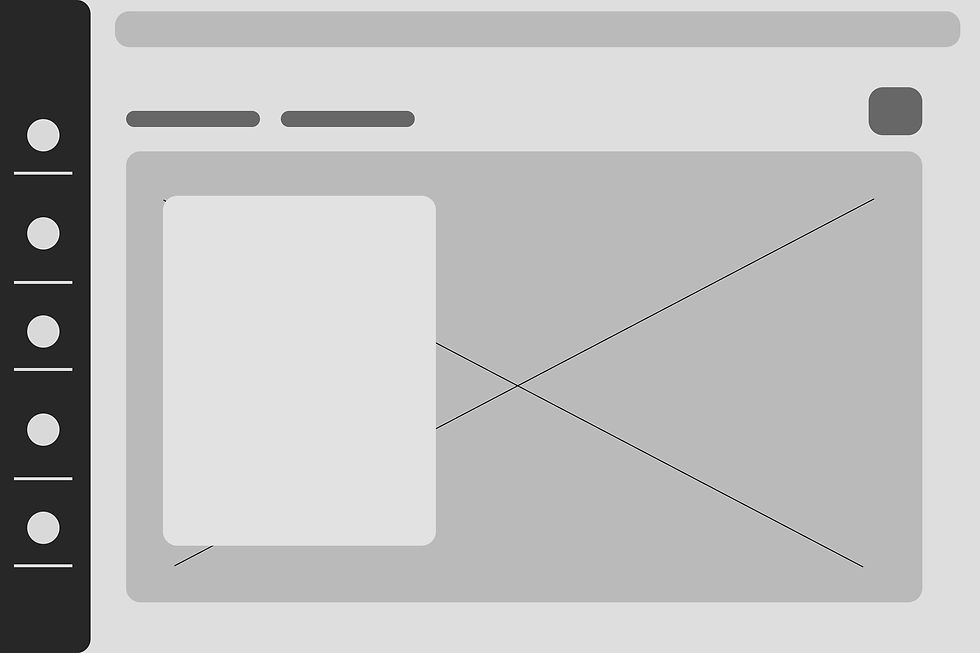

Main navigation menu
Detailed process visualization
Dashboard
Real time monitoring

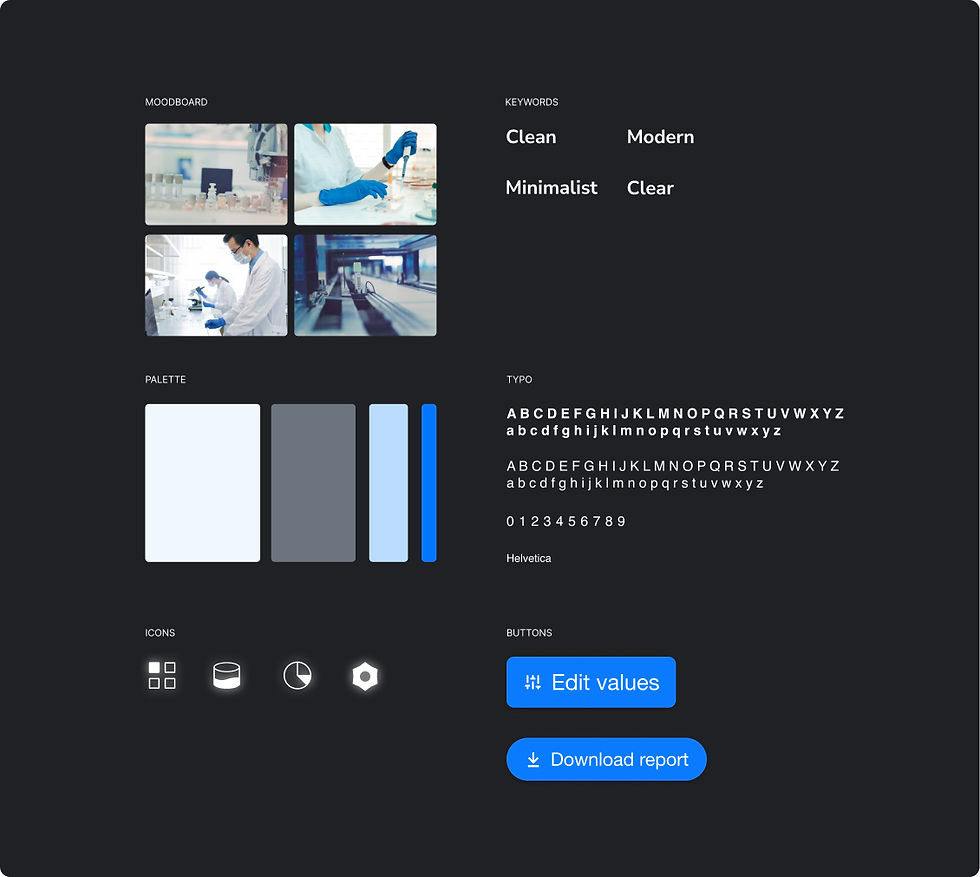
Visual design
Before
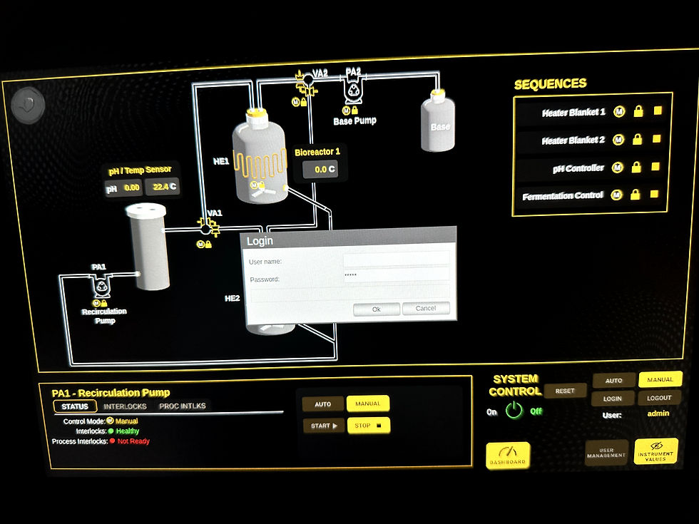
This was the main and, in fact, the only screen from which most maintenance aspects were controlled. The synoptic graphics doubled as buttons, which wasn't very clear. Overall, the design lacks consistency.



Design solutions


Enhance Navigation
Design the main navigation to focus on controlling and monitoring the cultivation process.
Separate Processes
Allocate an exclusive screen for maintenance tasks, providing an overview of the machine's operation.
Consistent Design
Maintain uniformity across the interface with comfortable font sizes and button placements, enabling error-free interaction for users.
Organize Information
Streamline the interface by dividing functions with a clear and visible main navigation menu.
Prototype
Validation: Measuring success
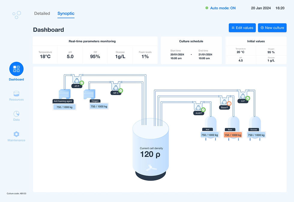
The synoptic
Due to time constraints, the prototype was quickly developed, focusing on the essential task of creating a new bacterial culture.
-
Faster Interaction: Reduced time to start a new culture.
-
Fewer Errors: Clearer workflows minimized mistakes.
-
Less Guidance Needed: More intuitive design lowered reliance on instructions.
-
Boosted Efficiency: Operators completed tasks faster and more smoothly.
During the design planning phase, I decided to remove interactive graphics from the dashboard, as they seemed visually cluttered. Surprisingly, the laboratory operators requested the synoptic graphics, something they were traditionally used to. To avoid overcrowding the dashboard, I added the synoptic as a viewing option. To keep costs and timelines on track, I adapted the existing graphics to fit seamlessly into the new design.
Wrap up and thoughts
When addressing topics laden with technical jargon, collaborative research is essential. There's no need to become an industry expert—rather, it involves working closely with the end user.
What might seem clear to a designer is not necessarily clear to users within highly specialized and technical industries. For example, consider the case of the synoptic display. As a designer, I saw the need to remove it because it appeared confusing. However, for the end users, laboratory operators, such terminology is common and familiar when reading information.
Many industries are still adapting to integrating UX processes into their operations. As a designer, it's crucial to consider this and make it a global objective in my work plan to gradually build and improve UX procedures within these companies.
© 2024 by Juliana Beltran
